WHATCOM COUNTY LIBRARY SYSTEMS
Creative Exercise
Branding
Illustration
As a creative stretch, I chose an imaginative project to demonstrate how illustration can elevate a clean brand. I picked one very close to my heart: the Whatcom County Library System.
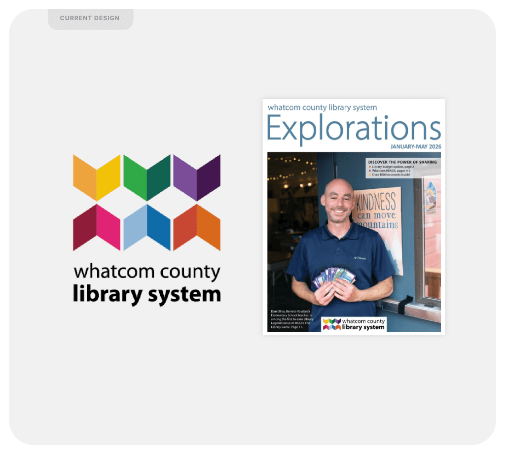
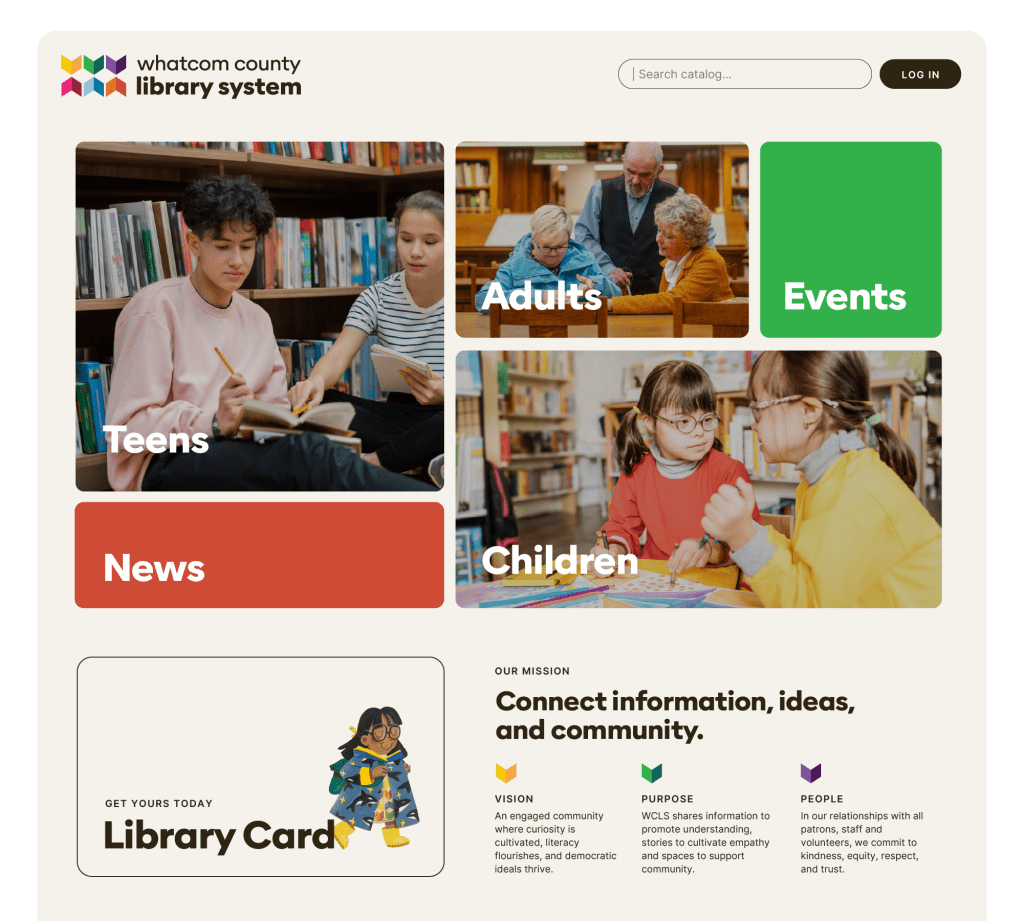
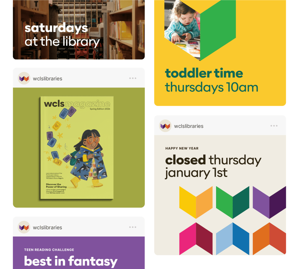
WCLS already has a thoughtful logomark—one that honors Whatcom County’s deep tribal roots, represents its cities, and introduces the colorful play that libraries deserve. As a brand designer, I would only alter what truly needs to be shined: strengthening the typography and making small but meaningful refinements to the logomark.
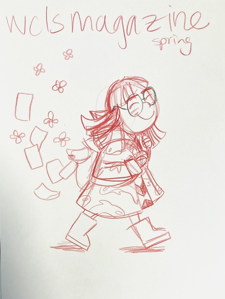
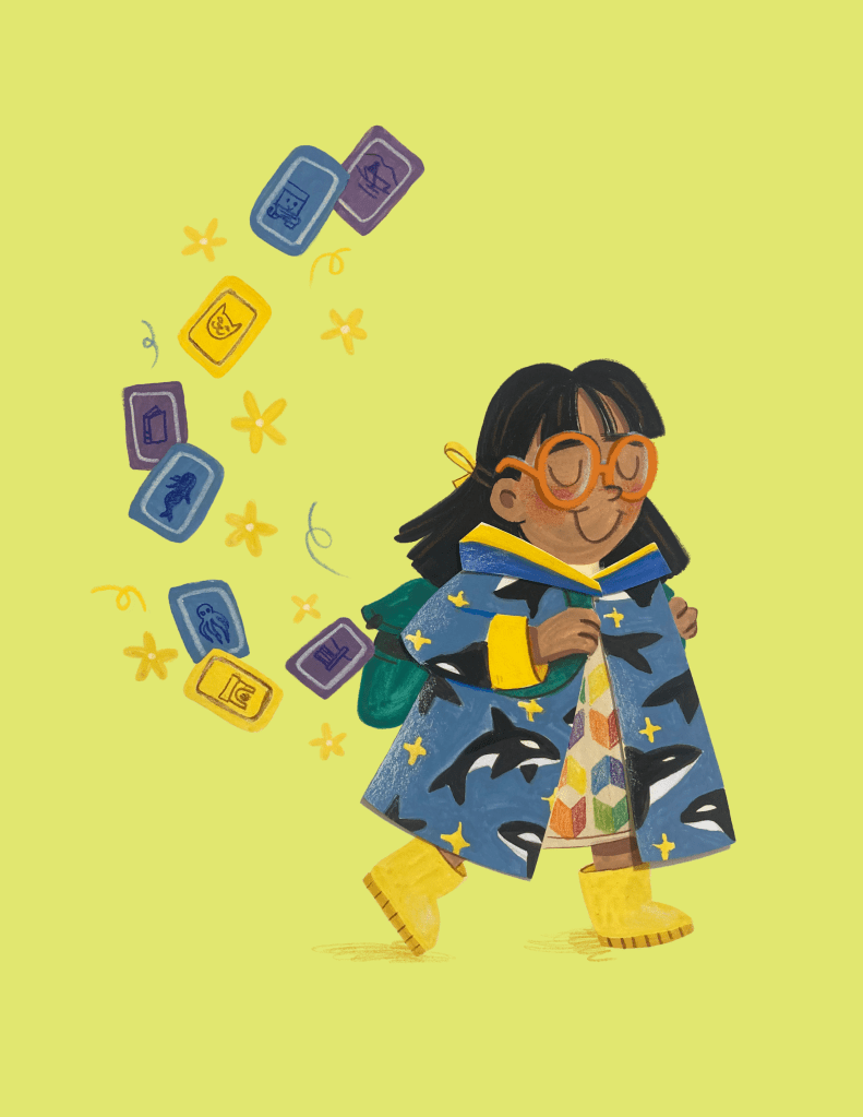
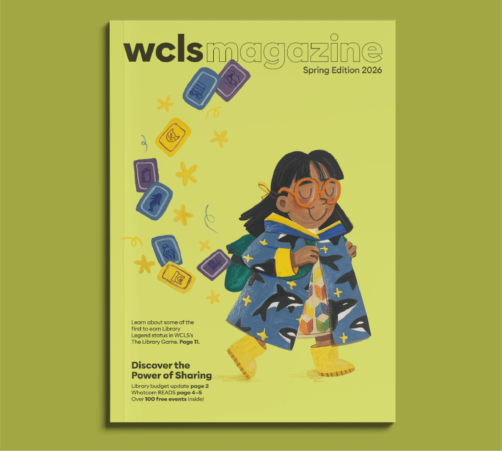
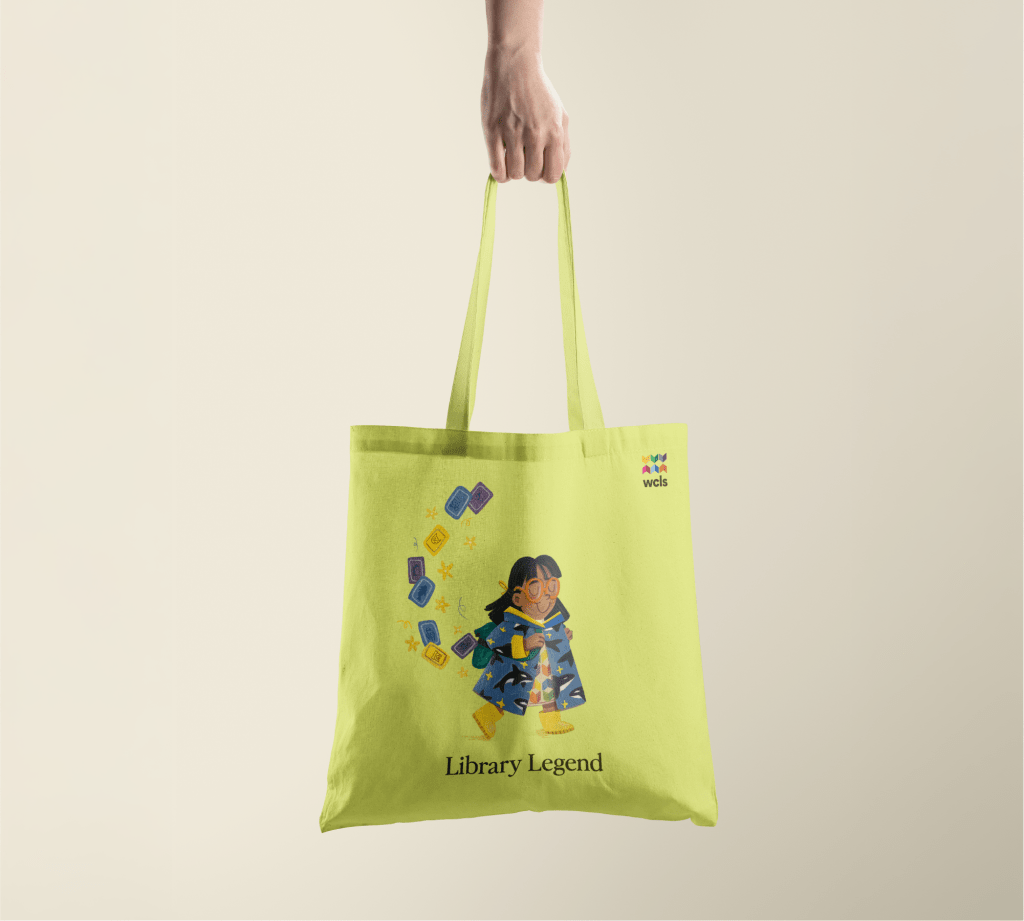
As an illustrator, though, there’s an opportunity to go further—by creating a local library mascot that represents our people and place in a playful, welcoming way. Enter: Aiyana, the orca-raincoat-wearing little bookworm. Redesigning the WCLS magazine was a great way to bring her on to the scene but she’d fit well anywhere: on a library card, a tote bag, or aiding in library way-finding.
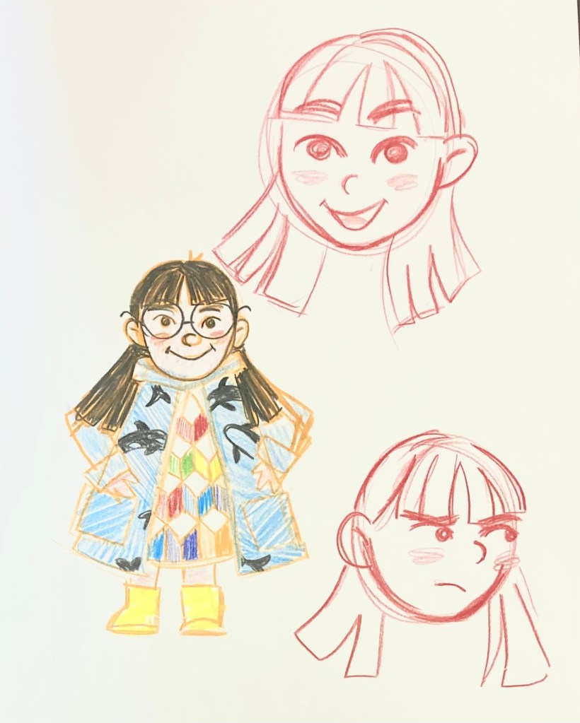
CHARACTER DESIGN
As always, I started with rough sketches. I had some clear goals in mind for this character: a young, Native American girl with clothing that matched the library branding as well as the rainy PNW vibes. Our PNW waters are home to orca whales, so I created a raincoat patterned with these mighty and beautiful sea creatures. The final illustration I hand painted with gouache and colored pencils, adding minor touchups in Procreate and Photoshop.
BRANDING REFINEMENT & BUILDOUT
Honestly, I love the colorful tribal-print book pattern of the current logomark and that it serves the dual purpose of referencing the six county towns. There are some minor issues of tangents created between shapes and inconsistent “shadow placement on the books. The font is also begging to be replaced with main-character-energy typography. I love the idea of the magazine as well—it has so much potential, it just needs a little glow-up!

© 2025 lydia dahl
